
Note
Go to the end to download the full example code.
Analyzing DenMune’s Sensitivity to the k_nearest Parameter#
The k_nearest parameter is the most critical hyperparameter in the DenMune
algorithm. The original paper claims that the algorithm is stable over a wide
range of k.
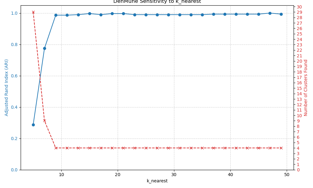
This example investigates this claim by running DenMune on a dataset with
varying values of k_nearest and plotting the resulting clustering quality, as
measured by the Adjusted Rand Index (ARI).
A stable algorithm should exhibit a plateau of high ARI scores across a range
of k values, rather than a single sharp peak.
import matplotlib.pyplot as plt
import numpy as np
from sklearn.datasets import make_blobs
from sklearn.metrics import adjusted_rand_score
from sklearn.preprocessing import StandardScaler

from denmune_skl import DenMune
Generate a dataset#
We create a dataset with clear, but slightly overlapping, clusters.
X, y = make_blobs(n_samples=400, centers=4, cluster_std=1.2, random_state=42)
X = StandardScaler().fit_transform(X)
Test a range of k_nearest values#
We iterate through a list of k values, fit a DenMune model for each,
and store the number of found clusters and the ARI score.
k_values = range(5, 51, 2)
ari_scores = []
n_clusters_found = []

for k in k_values:
    model = DenMune(k_nearest=k, reduce_dims=False, random_state=42)
    labels = model.fit_predict(X)

    # We only score if more than one cluster is found (and not just noise).
    if model.n_clusters_ > 1:
        score = adjusted_rand_score(y, labels)
    else:
        score = 0.0  # Assign a score of 0 if only one cluster or all noise is found.

    ari_scores.append(score)
    n_clusters_found.append(model.n_clusters_)
Plot the sensitivity analysis results#
fig, ax1 = plt.subplots(figsize=(10, 6))

# Plot ARI scores
color = "tab:blue"
ax1.set_xlabel("k_nearest")
ax1.set_ylabel("Adjusted Rand Index (ARI)", color=color)
ax1.plot(k_values, ari_scores, color=color, marker="o", label="ARI Score")
ax1.tick_params(axis="y", labelcolor=color)
ax1.set_ylim(0, 1.05)
ax1.grid(True, linestyle="--", alpha=0.6)

# Create a second y-axis for the number of clusters
ax2 = ax1.twinx()
color = "tab:red"
ax2.set_ylabel("Number of Clusters Found", color=color)
ax2.plot(
    k_values,
    n_clusters_found,
    color=color,
    linestyle="--",
    marker="x",
    label="Num Clusters",
)
ax2.tick_params(axis="y", labelcolor=color)
# Set y-axis ticks to be integers
ax2.set_yticks(np.arange(0, max(n_clusters_found) + 2))

fig.tight_layout()
plt.title("DenMune Sensitivity to k_nearest")
plt.show()

# An ideal result shows a wide plateau where the ARI is high and stable, and the
# number of clusters found is correct (4 in this case).
Total running time of the script: (0 minutes 0.475 seconds)